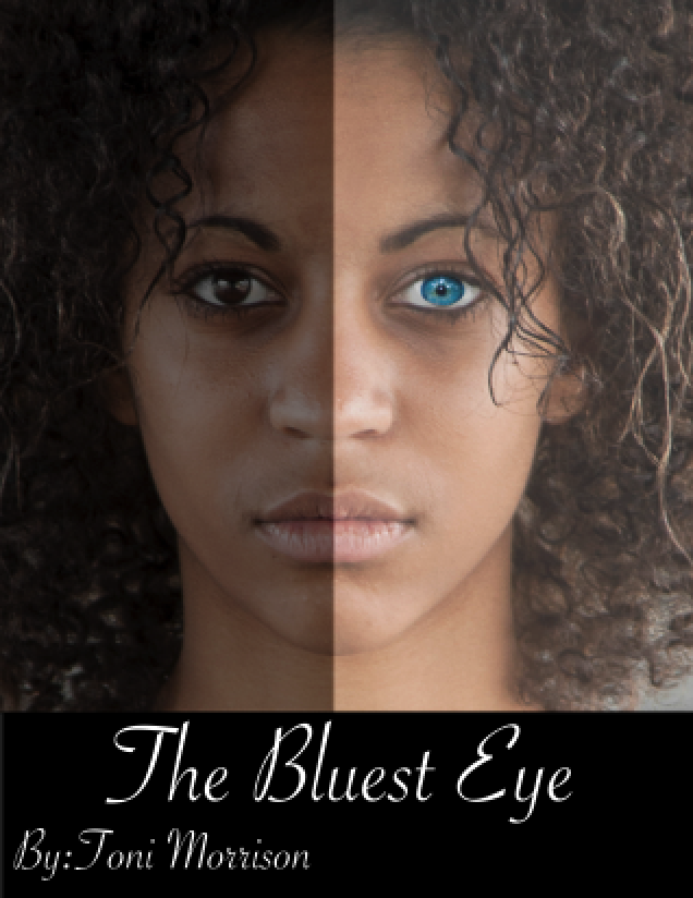
For this project Armisha utilized the Flickr Creative Commons search engine to find two high resolution photos for the book cover. One of the photos acquired is the young black woman who is the focal point of the cover and the other was a photo of a young woman with blue eyes. She used GIMP for all of her photo manipulations for this project on a standard US letter style layout. Instead of coloring one of the brown eyes blue, Armisha wanted a more natural blue eye color which is why it was selected for her second image. Armisha used the ellipse select tool to initially grab the blue eye from the secondary picture and she also utilized the free select tool to increase her selection accuracy by adding to her initial selection. Once an accurate selection was made, Armisha made the eye selection another layer and placed it on top of her background image which is the black woman. She also used the smudge tool to soften the edges between the two layers of the background and the blue eye for a more natural transition within the image. Armisha then horizontally flipped the image as she noticed that the model for this image has more defined blonde highlights on one side of the model's hair than the other, which went along with the theme of the novel that she wanted to address. Armisha then divided the image in half by using the rectangle selection tool to shade the left side of the image. By inverting her selection she tinted the right side of the image to highlight the color contrast she wanted within the cover. Once the image alterations were complete she used the rectangular selection tool to make the black banner at the bottom of the image for the title. Armisha filled this selection in with black and she used white lettering for an additional contrast. The font chosen for the cover is similar to the natural cursive font used for the actual novel which influenced her selection.